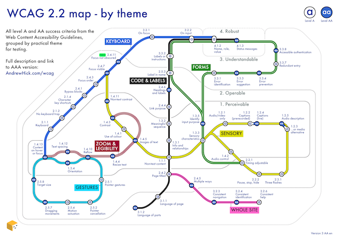
WCAG 2.2 map by theme

Select the image or see the WCAG map page for more detail. This diagram groups all the success criteria from the Web Content Accessibility Guidelines (WCAG) version 2.2 levels A and AA, by practical theme for testing. There's also an AAA version of the map.
Mind maps
I've found mind maps really helpful as a way of taking in large amounts of information. As a rule of thumb, I can fit a day's worth of training onto an A4 page.
Although I'm sharing them here, I'm aware the format is not accessible to everyone. Please get in touch using the details at the end of the page if you'd like more information. I would also recommend you seek out the original courses rather than relying on my interpretation of them.
Cypress (test automation tool)
Notes on using Cypress for end to end Javascript automation. From the brilliant Pluralsight course by Adhithi Ravichandran.

This helped me work on Defra's guide on using Cypress and Axe to run automated accessibility tests.
GOV.UK prototype kit
GOV.UK prototype kit training notes expertly delivered by Debs and Joe at Government Digital Service.

Official prototype course notes and tutorials from the prototype kit pages.
Manual to Automation Tester course
Four-day course on building test automation frameworks, delivered by Simon Stratton. It had bonus advice on some of the more evil elements of Javascript such as callbacks. Would definitely recommend attending if you're keen to understand the ecosystem of how automated tests work.


Designer induction
One-day induction for GOV.UK designers at the Government Digital Service. Thanks to Clara Teoh and Alison Foley for the great course!

Writing for GOV.UK
A course covering government content design from Leena Taha.

UX Bristol 2018
Including sessions on mapping users' mental models, giving feedback, silence and user research bias.
Credit to Mariana Morris, Walt Buchan, Ajara Pfannenschmidt and Emma Howell for the content.

Government Accessibility Meetup 7
This covered work on the EU Directive, accessibility statement research, what's new in Web Content Accessibility Guidelines (WCAG) 2.1, the Easy Read document format and building the "multiplication tables check" service.
Credit to Alistair Duggin, Leon Hubert, Katie John, Alastair Campbell, Ben Railton, Jane Wilkinson and Alan Hawkins for the content.

Interaction design
I've learnt a great deal from possibly the definitive guide to interaction design, About Face by Alan Cooper, Robert Reimann, David Cronin and Christopher Noessel. However, a 700-page book is not the most convenient of formats. Over a few weeks, I tried to condense it into a single sheet of A4. I reckon I got most of it in.
It covers all elements of user-centered design, including research, prototyping, usability, accessibility, visual design and user interface elements.

Abbreviations used | Publisher's website
User Experience Foundation Course
Delivered by David Travis at Userfocus. A great course on users' needs and the context they're in, then creating and testing usable software.


Performance Test Crash Course
A one-day course covering performance testing using JMeter. Delivered by Simon Stratton.

Advanced Test Analyst
A single page covering lots of test types in detail. Delivered by John Kurowski.

Javascript operators
A reference for the main operators in Javascript. From Professional Javascript for Web Developers by Nicholas C. Zakas

City maps
When looking into a city, I've made colour-coded maps to get the character of each area, based on browsing Google Streetview. It's very subjective and weighted towards what I was looking for at the time.
Although I'm sharing them here, I'm aware the format is not accessible to everyone. Please get in touch using the details at the end of the page if you'd like more information.
- Yellow = Posh houses that are way beyond a normal person's price range
- Orange = Smaller buildings with character, usually Victorian
- Brown = Generally semi-detached post-war architecture
- Blue = Modern, shiny buildings which look nice now but may not age well
- Pink = Generally, concrete
Bath

Bristol

Manchester
