Skip to content

Home icon | Portfolio | Design | Art | Maps | Photos | Puzzles | Blog

My wife approached me today and said “I’m currently embroidering gravel. Beige, grey, boredom.” (We are both into needlework and she is making a picture of a house.)

Naturally I made a connection to working in IT. Why embroider gravel, when you can embroider unicorns? Why not become a designer and make awesome unicorns all day?

Rainbow coloured unicorn butterfly kitten
[image found via staybuckedup on Imgur]

Design is not always shiny

This was my image of a design career a few years ago when I started to embark on a path towards it.

I’ve recently been doing some career soul searching, prompted by being turned down for a design job in the past few months. (For the record, I’m definitely entirely completely over this. I just needed more experience).

Design originally attracted me with the sparkly idea of ‘making websites look and feel nice’ until I realised you actually had to talk to the people who use the software you build. Don’t get me wrong, I love hearing what users have to say about a thing you’re making. But as an introvert, the idea of all this talking made me feel a bit uneasy. It made me question: is there a place in design for introverts?

Why research?

Our team helps people in England register to do things with waste, to help manage the environmental impact. After we recently released some code, our application’s approval rating leapt up from 84% to 94%. That’s pretty amazing, seeing as many people don’t have a lot of love for government bodies or filling in forms.

I like to think that much of this is because our fantastic researcher helped us listen to our users before we made the thing.

Even now I still come across so much software that has seemingly not been researched or designed, and it amazes me that such software companies make so much money. I shudder on the inside when I hear the word “enterprise” used anywhere near software, as it is generally bad, or at best, clunky.

Solitary working

I work in Quality Assurance (QA). My part in our service was through quiet analysis of the design and code, testing it all before and after development. You do need to talk to the team to understand how it’s going to work. But a lot of QA work is solitary, and that suits me right up. Writing code to automatically test something at the push of a button can be sometimes tedious, but you learn as you go along and it’s so satisfying when it works.

I work with the best team anyone could wish for. If the team was just introverted developers and testers building stuff to some mysterious specification, we’d still get stuff done. But it would be pants. Because we didn’t talk to the end users.

Yet there is still a place for introverts in an agile team. We need the time to stop, think, analyse, question. The QA person is often the one person being cynical when the rest of the team is being enthusiastic, but this helps get any badness of the way before a product gets to users.

We are all designers in our own way.

In an article I keep going back to, Hunter S Thompson said: The goal is absolutely secondary: it is the FUNCTIONING TOWARD the goal which is important.

The goal of design is a noble one: to give people something they actually need. But it’s the route to the good design which is important. There are so many ways to contribute to this, whether it’s prototyping a web page, listening to an unexpected rant from a user, coding some automated tests to make sure your changes haven’t broken anything, or rewriting swathes of code to make it more efficient. To many people, the solitary coding bits might feel like embroidering gravel. But to an introvert, that can be quite enticing.

It’s not just about unicorns.

The word ‘design’ comes with an allure of hipsters with shiny Macs building pixel-perfect, razor-sharp websites, but there’s so much more to it, some glamorous, some not.

Embroidering gravel might not be sexy, but it is necessary. To an introvert, it can be as perversely enjoyable as the shiny Mac stuff. And writing elegant, efficient code is just as important to the final ‘design’.

Oh and for the record, introverts can design well, whichever discipline they ultimately end up in. Don’t worry if you don’t like talking, you just have to be able to listen.

Related: 24 ways to look like an awesome UX designer by Guy Ligertwood

The beauty (and occasional frustration) of isometric games

I have an unhealthy obsession for cubes. Cubes are the basic unit of isometric games – like single blocks of Lego. They’re easy to see and understand, then can be expanded on to create puzzles, shapes and illusions. You can see which level you’re on, move between them with slopes and passageways, then subvert their geometry to trick the eye.

Isometric means “equal measure” – shapes have equal lengths and angles, making them easy to model on a computer.

Early computer games used an isometric projection to create a pseudo-3D effect. The graphics also looked crisp because a line close to 30 degrees could be drawn two pixels at a time without looking irregular or jagged.

Molecule Man

Molecule Man Screenshot

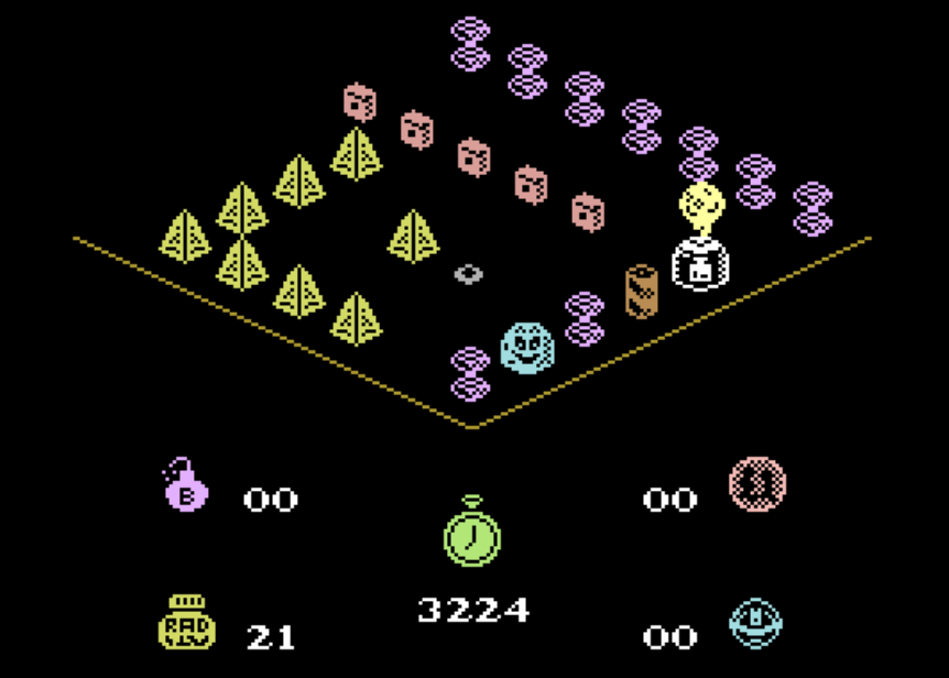
My first isometric game was Molecule Man by Mastertronic on the Commodore 16. In reality, the map was entirely two-dimensional and the isometric aspect only made the game harder to play - you had to master using Q/A/O/P to control the tiny man and find a paltry number of coins that made you choose whether to stay alive or blow things up.

Molecule Man's Garbled Face

What’s going on with his face though – which bits are his eyes?

Spindizzy

Isometric mushrooms from Spindizzy

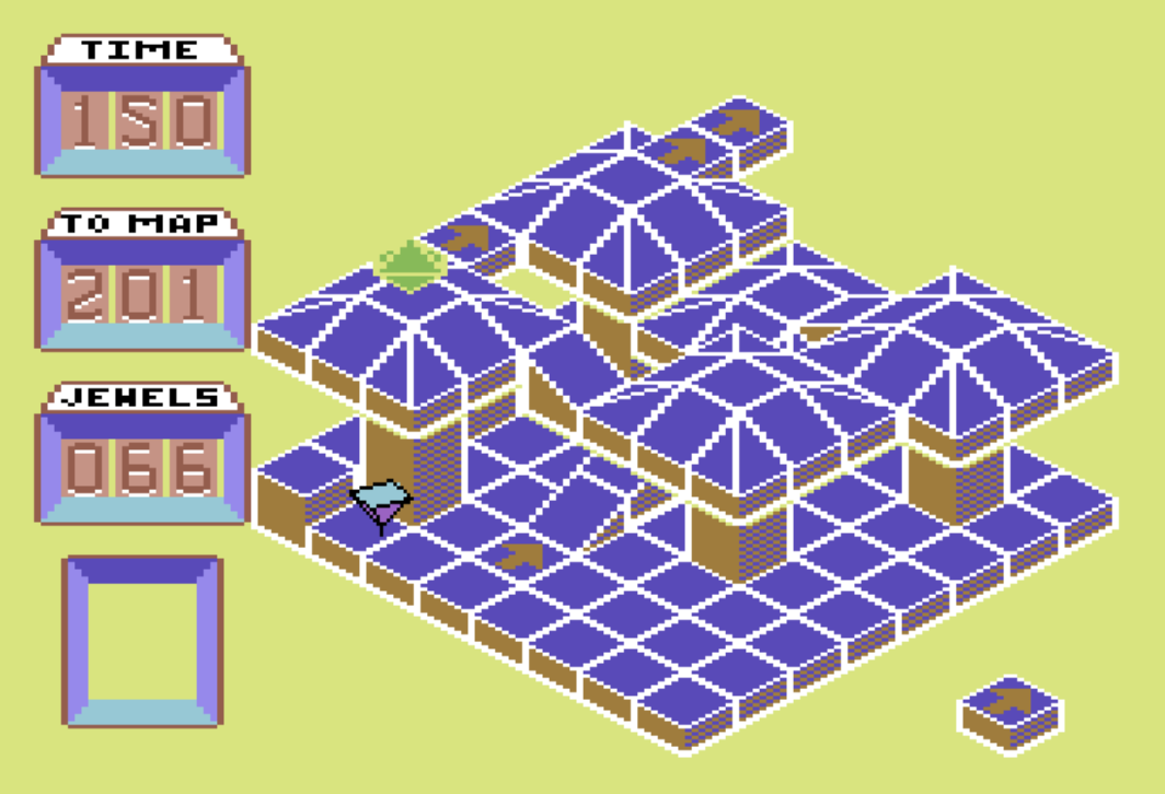
On the Commodore 64, things got even harder with Spindizzy by Electric Dreams. This game was cruel. Your time would sap downwards alarmingly quickly. You could replenish it by mapping new screens and jewels, but falling off an edge, or from a height of 2 blocks, or even using the space bar to stop yourself, incurred a hefty time penalty.

However it used its limited graphics to good effect with mountainous areas, mushrooms, and for some reason, the word HAWKWIND built into the map. Although difficult to control Gerald (your spinning top) the physics were very smooth, including bouncy and icy terrains.

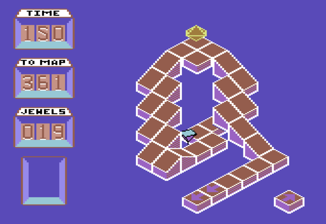
Difficult slope from Spindizzy

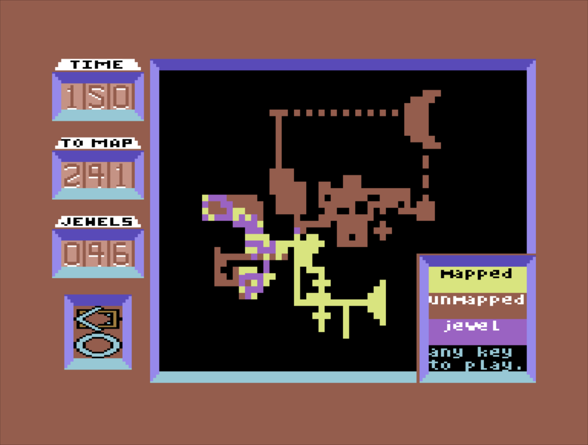
Try navigating this without falling off. And look at the size of that map.

Map of Spindizzy on Commodore 64

Head over Heels

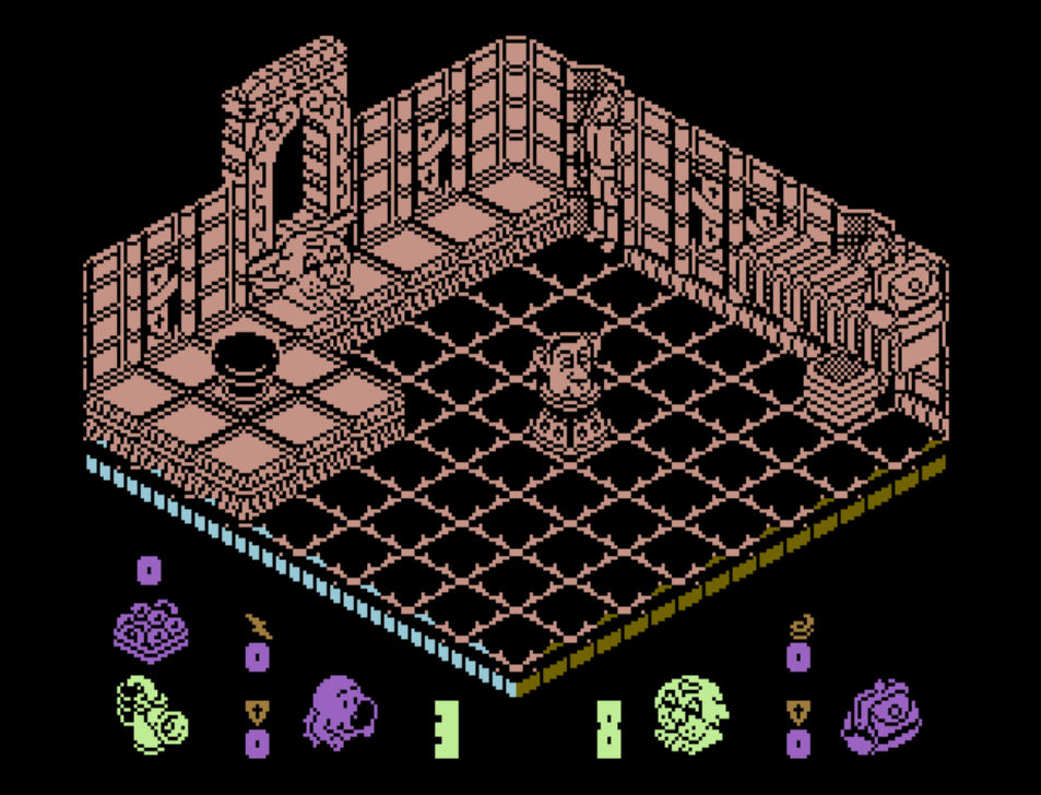
Head Over Heels screenshot with Prince Charles model

Slightly slower and more puzzle-based was Head over Heels by Ocean. The premise was two dog characters, one who can jump high and one who can run fast, joining together to liberate five planets.

Frustratingly, you’d often have no indication that some blocks disappear, leaving you to drift gently downwards onto some spikes. However, it was nicely pitched once you learnt how to time your jump over toasters, use each character to its advantage and control a Prince Charles caricature with an in-game joystick in order to retrieve a handbag to hold your doughnuts.

There’s a great 2004 remake of it here.

Marble Madness

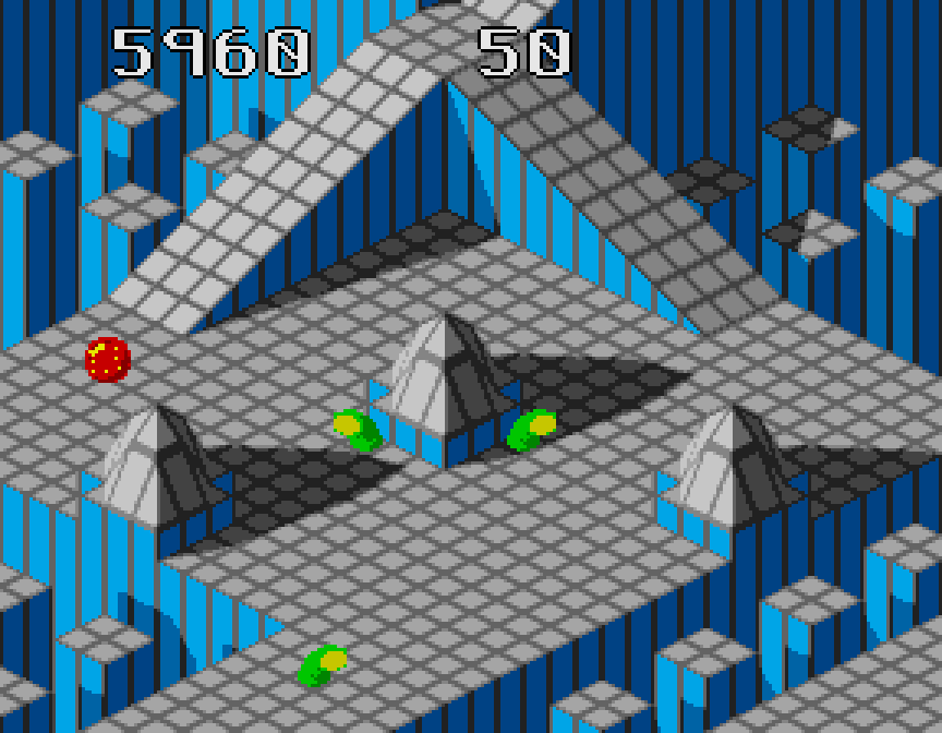
Marble Madness screenshot from Megadrive

I missed Marble Madness by Atari at the time. However, it’s slightly more forgiving than Spindizzy as well as having shadows, animated enemies and (a first for this list) music. The premise was to roll a ball quickly down some slopes while avoiding gloopy things.

Sonic 3D

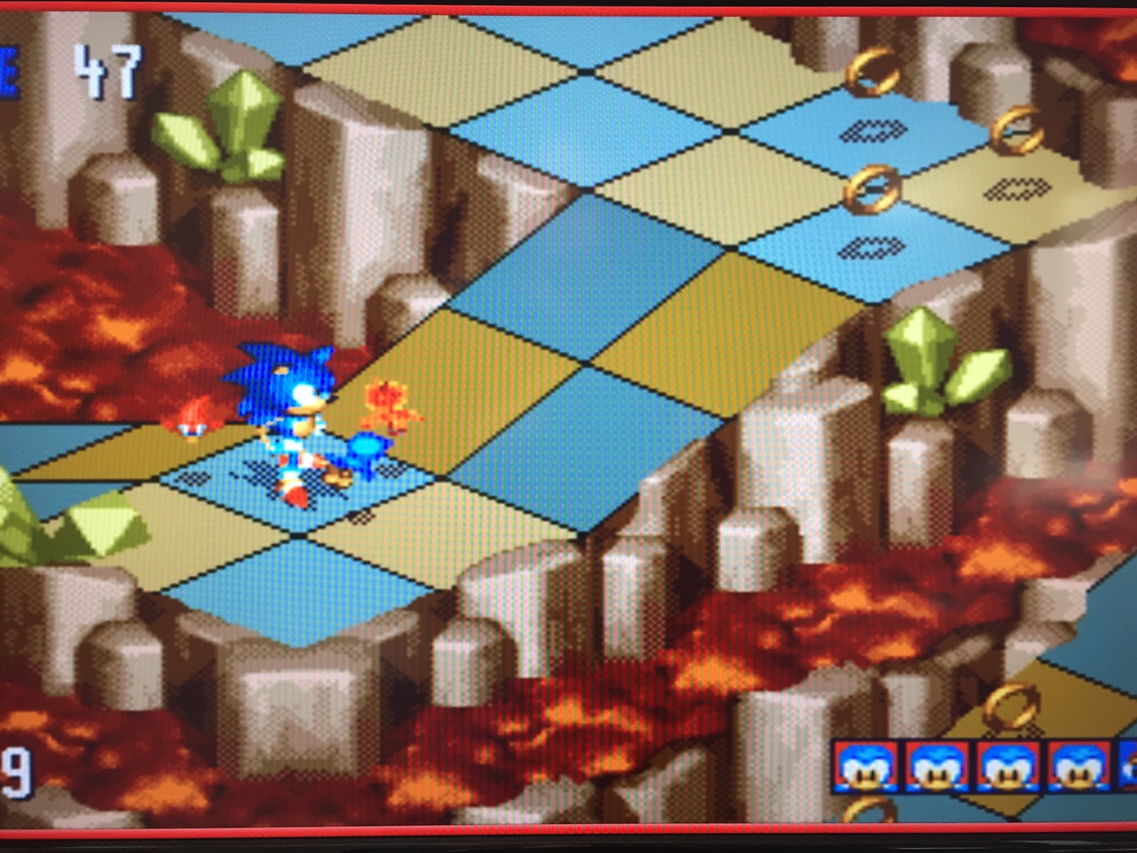
Sonic 3D screenshot

Sonic 3D – Flickies’ Island (aka Sonic 3D Blast) by Travellers’ Tales couldn’t quite make up its mind whether it was a fast-paced action game or an isometric puzzle. It had the Sonic trademarks of loop-the-loops and secrets behind crumbly walls. However, you had to take the game slowly to survive. Going fast for anything more than a few seconds would invariably mean you’d get hurt and have to pick up birds which had got scared and run off a slope.

A good game overall, marred by a couple of things: the difficulty of aiming at things due to the isometric viewpoint, and the frustrating Mega Drive (Genesis) special stage, which despite what people say, is actually quite hard and means you have to replay the whole game if you fail at it and want a chance at the final boss.

Pseudo 3D to real 3D

There seemed to be a long break in isometric games for some time – perhaps because great games were appearing in “proper” 3D, like Tomb Raider on the Playstation or Ico on the PS2. The true 3D element didn’t always add to the gameplay though – Sonic Heroes on the PS2 was just clunky with over-complex controls for example. Games would try to hide their blockiness except in sub-games, like the satisfying temple puzzles in Final Fantasy X.

All the isometric games I’ve mentioned so far have had one fault – they are frustrating to play in one way or another. The real joy of isometric gaming is discovering secrets on the other sides of the cubes.

A character should be free to explore, try things out and enjoy the scenery without the fear of falling off or getting killed with lasers. All of which is a great time to mention Monument Valley.

Monument Valley

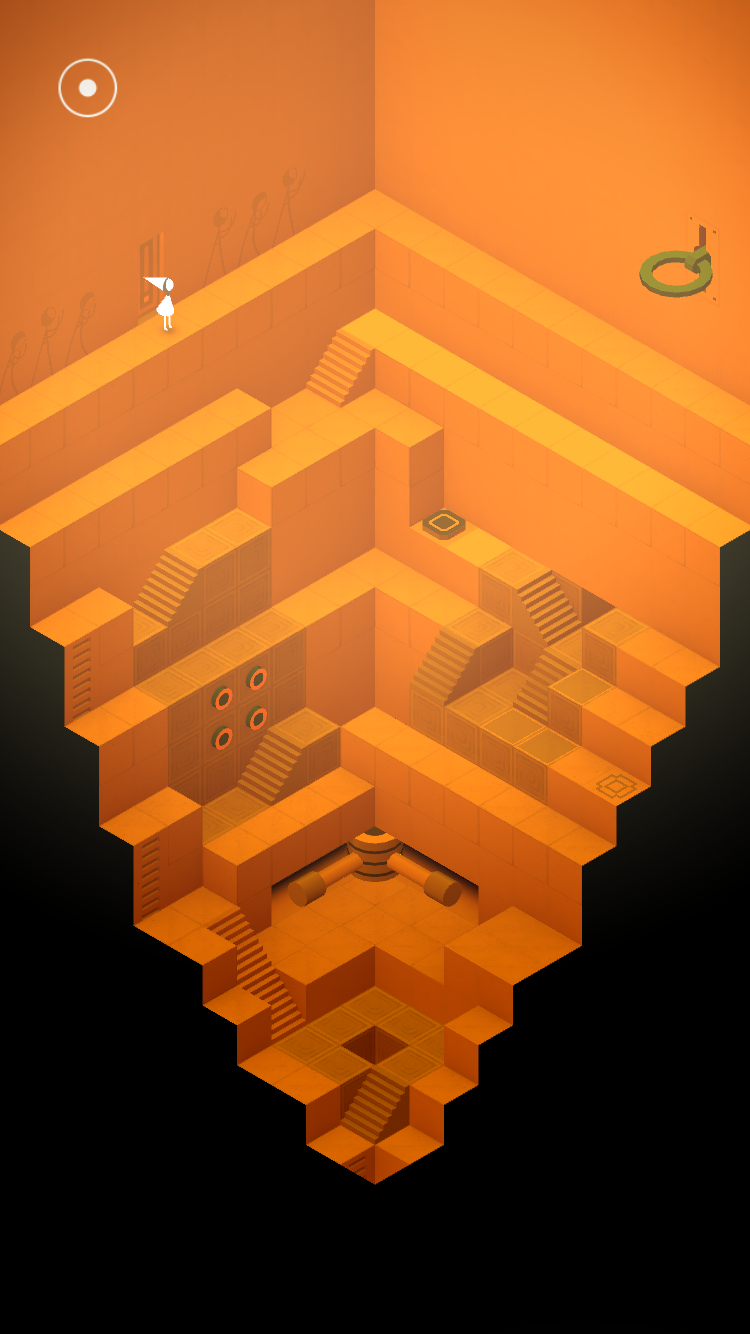
Optical illusion from Monument Valley

Cube-based labyrinth from Monument Valley

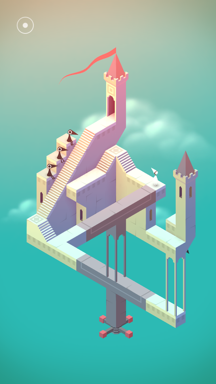
Monument Valley by UsTwoGames is the perfect isometric puzzle game. Some might say it’s too easy, but that gameplay time is pure pleasure as you guide Princess Ida around Escher-inspired optical illusions and Penrose triangles, avoiding angry crows and restoring the sacred geometry. All this with a lush, enveloping, meditative soundtrack.

It avoids difficulty of controlling with arrow keys or Q/A/O/P because you simply tap where you want to go. If you can move there, then you do. If not then you have to adjust something elsewhere on screen.

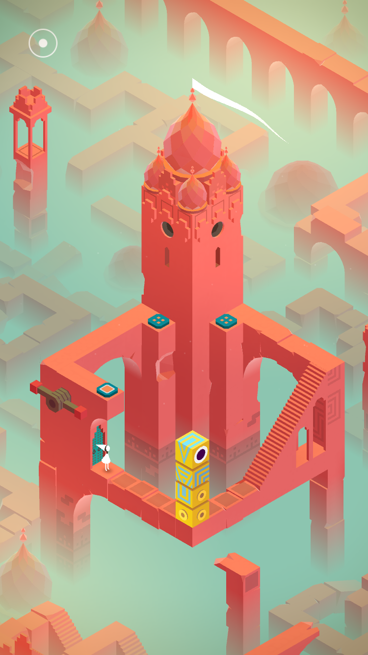
Red tower from Monument Valley

As far as I know it’s impossible to fail at the game. The crows get angry but won’t hurt you, and occasionally help you. The puzzles are not always obvious but they propel you gradually forwards in a satisfying way.

The game lets you pick up and play around with parts of the isometric layout, opening up things that weren’t obvious and bending the rules of geometry to help you explore, and occasionally turn inside out, a wide range of beautiful scenery made out of cubes.

Exploration over coordination

The best bits of isometric games lie in the exploration, not clinging on to a narrow slope while simultaneously navigating a deadly toaster.

There are reasons my logo is an isometric cube and my Instagram username is isometrify. Isometric games constrain the world into a simple set of rules, but when you bend those rules as far as they will go, the results can be beautiful.

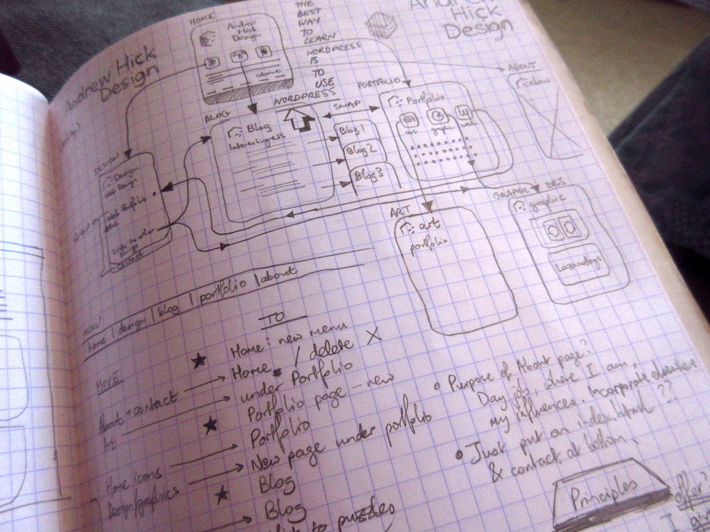
Sketch of site redesign

I’m starting this blog as an attempt to share my exploration notes in the field of design, general inspiration and give myself a kick up the bum of creative output.

My angle is: I’m working on an eventual career change from quality assurance to interaction design. As part of this I’m teaching myself the skills I’ll need to make the move. In an attempt to help anyone on a similar path I’d like to share career advice that has worked well so far, any interesting guidance I’ve picked up on the way, and anything that just looks and feels nice.

Most designers I’ve spoken to have been involved in web design as part of their career, and this site and blog are helping me to use those skills.

I work in a wonderful team that has that rarest of things, the opportunity to carry out true user-centred design in an agile way. We’ve just made our service public. It helps people who take water out of the natural environment in England to manage their abstraction licences online.

The challenge I currently face though, is finding opportunities to sketch and prototype in my role while focussing on the day job, without treading on anyone’s toes.

Some great advice I’m working on so far comes from Guy Ligertwood’s “A guide to becoming a UX designer at age 40”.

I’m also finding Medium a great source for design thinking. There's plenty to mull over in this post by Andrew Wilshere about becoming a designer without going to design school.

In the meantime, I’m going to try and get my own house in order and make my own site show more clearly what it's there for.